Lead designer
Sefaria Library Assistant
Role
Lead product designer (Contract)
Company
Sefaria
Timeline
6 months
Product
AI study assistant in the Reader
Project stage
MVP shipped, post-launch improvements underway
Responsibilities
UX Research • Interaction Design • Design Systems
Tools
Figma, FigJam, Figma Make, ChatGPT, Claude
Outcome
Shipped an MVP that established source grounding as the foundation of user trust and laid the interaction patterns for future AI experiences in the Reader.

The . brief
Sefaria is one of the most trusted Jewish text libraries in the world. When I joined on contract, the organization was under board pressure to ship an AI assistant, and they needed someone to figure out what that actually meant. There were no designs. No prior research. And until recently no product designer, the work had been carried by a graphic designer whose instincts had taken the product far, but the product had grown beyond what instinct alone could support.
Sefaria had ambitious plans for AI, but there were no established product design foundations to build on.
Before designing an assistant, I first needed to understand the people it was meant to support and create the systems that would allow it to scale.
The . tension
Starting with users, not features
When I joined, most conversations started with solutions.
How should the assistant look? Which AI features should it include? How could it feel competitive with other AI products?
Those were reasonable questions, but they skipped a more important one:
What problem were users actually trying to solve?
At that point, nobody had actually spoken with users.
I advocated for a research phase before any design work began. There wasn’t dedicated time for it, so I built the research plan, wrote the interview guide, recruited participants with marketing, and synthesized the findings before moving into design.
Nobody had actually spoken with users yet.
Research was not originally part of the plan. I advocated for incorporating it early, and the findings ultimately influenced both the product direction and several MVP decisions.
Throughout the project I kept bringing conversations back to user behavior. When discussions drifted toward feature parity with other AI products, I redirected toward what we'd heard from users. When there was pressure to move quickly on onboarding, I pushed for simpler interventions grounded in what was actually causing confusion. The research gave us a shared language for those decisions.
Research findings
11 interviews. 3 findings that changed everything.
Across interviews and survey responses, three patterns consistently emerged. Together, they reshaped how we defined the problem and guided every major product decision that followed.
01
Trust comes from Sefaria, not from AI
Users weren't adopting the assistant because it was impressive AI. They were trying it out because they trusted Sefaria. One participant said he trusted it more than any other AI tool, because its sources came from Sefaria's library. That's the differentiator.
02
Users saw it as a study tool, not a chatbot
Users weren't just looking for answers, they were reading, verifying, gathering sources, and continuing their learning. This drove almost every major design decision: source links, readability, docking, onboarding, and future thinking around source sheets.
03
Nobody knew it was beta
Multiple users couldn't calibrate their expectations because the product wasn't communicating its own status. Their trust in Sefaria extended to the assistant, which made any AI errors feel more surprising than they should have.

Therefore
These findings changed our definition of success. The goal was no longer to build an AI assistant that looked familiar. It was to design a study companion that behaved like a natural extension of Sefaria’s reading experience.
The reframe
From "look like AI" → "behave like Sefaria"
The research reframed the project. Rather than mimicking familiar AI products, the assistant needed to reflect the qualities people already trusted in Sefaria: thoughtful sourcing, clear language, and an experience that supported study rather than interrupted it.
Research also made something else clear: the assistant wasn’t a separate product. It was another part of the Reader.
Parallel workstream
In parallel, I also helped mature the product’s design foundations. That included cleaning up inherited variables, introducing semantic tokens, and establishing reusable patterns so new AI surfaces could integrate consistently with the rest of the Reader.
The core insight
It wasn't an assistant problem. It was a Reader problem.
Sefaria’s Reader was built for uninterrupted study. Adding AI introduced a new challenge: how do you add another layer of functionality without competing with the reading experience itself?
Once AI became part of the Reader, every layout decision became a reading decision.
The project shifted from 'where do we put the AI panel?' to 'how should a reading environment behave when AI becomes part of it? This realization influenced every major interaction decision that followed, panel sizing, breakpoint rules, docking behavior, resizing constraints, and content prioritization.


Left: floating mode below 1280px. Right: docked mode at 1280px and above.
What I designed
Interaction design across the full assistant experience
Supporting different learning behaviors
Floating vs Docked panel behavior
Users needed flexibility, some wanted a persistent workspace while reading, others wanted something lightweight and temporary. Rather than forcing a single model, I designed both floating and docked experiences, with a 1280px breakpoint determining when docking became available. Below that threshold, forcing a docked state would have compressed the Reader to the point of breaking the reading experience.
Below
1280px
Above
FLOATING
Below 1280px
Library Assistant
Reader uses full width. The assistant floats as an overlay, lightweight and temporary. Docking is hidden below this threshold because compressing the Reader would break the reading experience.
DOCKED
1280px and above
Library Assistant
Reader and assistant share horizontal space.
Reader and assistant share horizontal space. Docking becomes available, the assistant is persistent and integrated, supporting side-by-side study without overlapping the text.
Panel resizing behavior
Constraints and resize rules
The panel is anchored to the bottom-right of the viewport, right and bottom edges never move. Users resize by dragging the bottom-left handle, expanding the panel left and upward. This directional constraint protects the reading surface while giving users meaningful control over how much space the assistant occupies.
VIEWPORT
Library Assistant
~560px
content
max width
Ask a question...
expands left
expands upward
Resize handle
bottom-left
Anchor
bottom-right
fixed
CONSTRAINTS
Min width
300px
Max width
720px
Min height
456px
Max height
80vh
At max height
Message area scrolls
panel stays in viewport
Calibrating trust and expectations
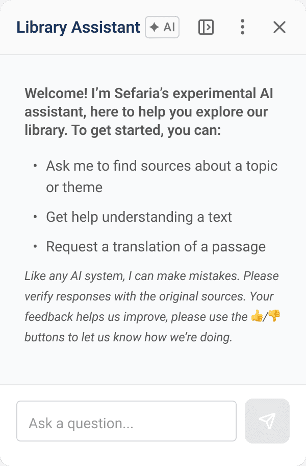
Onboarding and welcome states
I distinguished between 3 distinct entry states: first-ever open, new session, and post-restart, each needing different copy and a different level of cognitive load. The beta clarity finding from research directly shaped this work, I explored low-effort tooltip walkthroughs and onboarding patterns that could set expectations without requiring heavy engineering lift.


Preserving readability during long-form study
Response layout and content constraints
Constrained message content to ~560px at maximum panel width. Long line lengths reduce readability, especially for explanation-heavy, source-heavy, multilingual responses. I also considered hierarchy carefully, after submission, the AI response is the primary reading material, not the user's original prompt.
Library Assistant
✦ AI
~560PX MAX CONTENT WIDTH
UNUSED PANEL SPACE
↔ Content constrained even at max panel width — long lines reduce readability
At maximum panel width, response content is constrained to ~560px. Additional width becomes empty space , preserving comfortable reading.
Supporting exploration without losing context
Restart, stop generation, and feedback
Designed a lightweight confirmation popover for new chat, clear enough to prevent accidental conversation loss, light enough not to interrupt the learning flow. The Send button converts to Stop during generation, with partial content preserved and the composer rehydrated so users can edit and resend. Thumbs up/down with hover tooltip labels and clear post-click states.
Library Assistant
↑ anchored to overflow menu
Start a new chat?
This will clear the current
conversation.
Cancel
Start new chat
Popover anchors to the overflow menu — keeping the interaction close to its source. Clearing a conversation is potentially destructive so it deserves confirmation, but a full modal would feel too heavy for a learning context.
Tradeoffs and constraints
Real decisions made under real constraints
Flexibility over simplicity
Users wanted different ways to interact with the assistant, some preferred a persistent workspace, others something lightweight. Rather than forcing a single model, we designed both floating and docked modes. That decision cascaded into breakpoint rules, resizing logic, and a rethink of the Reader layout.
Trust before feature breadth
Rather than shipping every expected AI feature, we focused on source grounding, readability, and onboarding first. The research told us trust was the differentiator, so we protected it, even when that meant a smaller MVP.
Deferring what we knew users wanted
Copy, export, and source sheet creation emerged clearly from research as high-value future features. Engineering constraints made them unrealistic for launch. We shipped the foundation and documented the direction, so the next phase had somewhere to build from.
Outcomes
What shipped...and what’s next
Shipped @ MVP
Library Assistant in the Reader
Floating + docked panel
Onboarding + welcome states
Restart + stop generation
Feedback controls
Response readability system
In progress
Hebrew string support
(currently shipping)
Research findings influenced multiple MVP decisions before launch. Source grounding became a core design principle rather than a secondary consideration. The interaction patterns established for floating, docking, resizing, and onboarding created a foundation for future AI work within the Reader. And the thinking around source sheets, saving, and learning workflows is already informing post-MVP direction.
What I wish I had time to tackle next
These themes kept coming up in research and kept coming up in conversations with the team. They weren't cut because they were unimportant. They were deferred because trust had to come first. But they represent the next natural layer of the product:
Source sheet integration
Users repeatedly asked when they could turn assistant responses into source sheets. That workflow would connect the assistant directly to one of Sefaria's most loved features and deepen the learning-layer thesis significantly.
Save and share workflows
Copying, exporting, and sharing responses with a chavruta were among the most requested features. Building those would shift the assistant from a query tool to a genuine study companion.
Contextual onboarding and guidance
The beta clarity finding points to a bigger opportunity: an onboarding system that surfaces capabilities in context rather than upfront. Suggestion chips, progressive disclosure, and text-aware prompts could all help users understand what the assistant can do without front-loading cognitive load.
Reflection
When I joined Sefaria, I thought I was designing an AI assistant. This project taught me something much more valuable. The hard part wasn’t introducing AI. It was protecting an experience people already trusted.
That shift changed nearly every decision that followed. Instead of asking how the assistant should behave, we started asking how the Reader should behave once AI became part of it.
It’s a mindset I’ll carry into every project. Before designing solutions, I want to understand the behavior we’re trying to support. Sometimes the best design decision is realizing the team is solving the wrong problem.
Thank you for stopping by!
If you'd like to say hello, chat about design, feel free to reach out to me here.