april Filer uplift
In the previous tax season, the focus of my designs were on V1 of the product, ensuring that we had a functional and intuitive flow within technical capabilities. Now that this was behind us and we had some more bandwidth, I sought to opitmize the visuals.
Introduction
UX Audit
I conducted a comprehensive UX review of the app, analyzing flows to identify improvement opportunities. With a clear understanding of previous years' limitations, I collaborated closely with the Head of Product to propose changes. After evaluating effort sizes for Design and Engineering, we decided to implement the changes in three stages.

Effort sizing opportunities for this project
Some before and afters
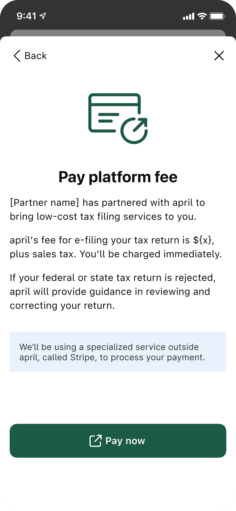
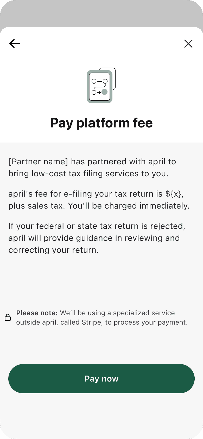
Pre-flow explainers
I refined our "explainer screens," renaming them "pre-flow explainers." These screens precede user flows, providing context for what’s ahead. Previous feedback indicated that users often overlooked these, so in this update, I focused on designing a screen that created a stronger association with the start of a flow—similar to the first page of a book chapter.
Before
AFTER
Before and afters of “Explainer” screens
Acknowledgement PAttern
In a previous tax season, users often ignored the “Confirm $0 AGI” screen to quickly progress, leading to incorrectly rejected returns. Through user feedback and understanding the importance of this confirmation, I realized the design wasn’t emphasized enough as a critical warning. To improve its effectiveness, we focused on designing an acknowledgement that would better capture the user’s attention.
Before

AFTER

Before and afters of "acknowledgement" patterns
Partner customization
Previous designs had utilized gradients and some visual elements that did not feel unbranded enough when embedded in an app. In this uplift, I sought to have designs that felt more “neutral” and less specific to the april brand.
Additionally, I made some updates to the product’s type system, including utilizing system fonts, as many apps do, replacing april’s branded fonts.
screen 1

screen 2

Implementation of partner branding to screens
Some thoughts 💭
This project was truly a more-than-I-expected fun one! What started as something broad (simply a "Hey Adina! How can we make some UX/UI improvements on a tight timeline?") resulted in impactful changes across the product.
Thank you for stopping by!
If you'd like to say hello, chat about design, feel free to reach out to me here.